Add Row
Add Element
LinkDaddy SEO
update
LinkDaddy® : SEO, PPC & Content News for Online Success
update
Add Element
  • Home
  • Categories
    • SEO News
    • Digital Marketing Trends
    • Content Marketing
    • Social Media Marketing
    • PPC and Paid Advertising
    • Analytics and Data
    • E-commerce SEO
    • Local SEO
    • Industry News
    • Case Studies
    • Tools and Technology
    • Expert Interviews
    • Extra News
    • Inbound Marketing
    • Affiliate Marketing
    • Outsourcing
    • Digital Transformation
    • Style
    • Web Development
    • Marketing Automation
July 28.2025
3 Minutes Read

How to Create Proportional Equal-Height Image Rows with CSS

CSS webpage layout with equal-height image grid

Mastering Equal-Height Image Rows with CSS: A Step-by-Step Guide

In today's digital age, where visuals play a paramount role in capturing audience attention, ensuring a clean and organized layout is crucial for businesses seeking to make an impact online. One common issue web developers face is creating image rows that are not only visually appealing but also maintain equal heights across varying image dimensions. This article delves into practical techniques to achieve proportional equal-height image rows using CSS, enriching your web development toolkit.

Understanding the Challenge: Image Row Disparity

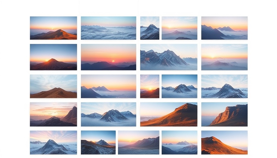
Images are central to web content, enhancing user engagement and overall aesthetic appeal. However, when images of different heights are placed side by side, the result can lead to a disorganized appearance, detracting from the user experience. This problem is especially prevalent in e-commerce websites and portfolio galleries, where a uniform visual presentation is essential to brand image and usability.

CSS Flexbox: A Modern Solution for Designers

CSS Flexbox has revolutionized the way we approach layout design. By leveraging this powerful tool, developers can create equal-height image rows effortlessly. The key is to set up a flex container that houses your images. Here’s a simple snippet to get started:

.image-container { display: flex; flex-wrap: wrap;
}
.image { flex: 1; // Ensures flex items grow equally margin: 5px;
}

This code snippet establishes a flexible container that adapts to the screen size and ensures that all images within this container adjust to the same height, no matter their individual sizes.

The Advantages of Equal-Height Image Rows

Creating equal-height image rows offers more than just aesthetic appeal—it enhances the website's functionality and user interaction. Here are several benefits:

  • Improved User Experience: Users scan web pages rapidly. Uniform image rows allow for a smoother visual experience, facilitating easier navigation.
  • Enhanced Mobile Compatibility: As mobile users dominate internet traffic, the responsive nature of Flexbox ensures that your layouts remain consistent across devices.
  • SEO Benefits: Properly sized images contribute to faster load times, enhancing your website's SEO health and user retention.

Using Grid Layout for Complex Designs

While Flexbox is a robust solution for equalizing image heights, CSS Grid offers a level of control that is particularly beneficial for more complex layouts. Grid can help position images within a structured template. Here’s a basic starter code:

.grid-container { display: grid; grid-template-columns: repeat(auto-fill, minmax(200px, 1fr)); gap: 10px;
}
.grid-item { align-self: stretch; // Makes all grid items align to the grid cell height
}

This will create a responsive grid that automatically fills the available space while ensuring all images stretch to occupy the full height of their respective grid cell.

Tools For Testing and Implementation

To fine-tune your image rows, several digital marketing tools can aid your implementation process:

  • Google Analytics: Monitor user interaction with image placements and adjust based on data-driven insights.
  • Visual content marketing strategies: Utilize visuals effectively to communicate messages, leading to higher engagement rates.
  • Website optimization tips: Focus on optimizing load times for images to retain visitor attention.

Future Predictions: The Evolving Role of Visuals in Marketing

As digital marketing trends evolve, the emphasis on compelling visuals will only increase. Reports suggest that by 2025, video marketing strategies and visual tools will dominate content engagement metrics. Marketers will need to adapt quickly to leverage visuals effectively within their campaigns, making the skills you acquire now even more vital for future success.

Concluding Thoughts: Elevate Your Web Design With CSS

Mastering equal-height image rows with CSS not only supports your design goals but enhances your site's SEO and user engagement. As marketing strategies increasingly rely on visual components, mastering their presentation becomes essential. Utilize the techniques discussed, and stay ahead in an ever-evolving digital landscape. Don't just design your website; craft an experience that resonates with your audience!

Web Development

11 Views

0 Comments

Write A Comment

*
*
Related Posts All Posts
11.01.2025

Essential Insights on How to Choose the Right Web Hosting Service

Update Understanding the Importance of Choosing the Right Web Hosting Service When embarking on the journey to create a website for your business, one of the first and most critical decisions you’ll need to make is selecting a web hosting provider. A web host is the backbone of your online presence, providing the infrastructure necessary to store your website's files and make them accessible to users around the globe. With numerous hosting options available, understanding your unique requirements is essential for a seamless experience. Web Hosting Basics: What You Need to Know Web hosting refers to online services that allow individuals and organizations to publish websites onto the internet. A web host typically offers features like storage, bandwidth, and sometimes additional tech support to enhance your site's performance. The significance of a reliable host cannot be overstated: it guarantees your site is active, secure, and performs at optimal loading speeds, affecting user experience and SEO. Five Key Steps to Selecting the Right Host Here are five foundational steps to guide you through the selection process for the best web hosting service for your needs: Assess Your Website Needs: Is your site a simple blog or a high-traffic e-commerce platform? Understanding the nature and purpose of your site helps determine the type of hosting (shared, VPS, dedicated) you’ll require. Research Potential Hosts: Take the time to compare different hosting providers, focusing on reliability, pricing, features, and customer reviews. Popular hosts like Bluehost, HostGator, and GoDaddy have earned strong reputations through reliability. Evaluate Hosting Features: Look for hosts that offer essential features like SSL encryption for security, backups for data recovery, and customer support that’s available round-the-clock. Choose the Right Plan: Many hosts offer various packages—make sure to select one that aligns with your site's projected traffic and resource needs. Check for Growth Flexibility: As your business grows, your hosting needs may evolve. Choose a provider that can accommodate scalability without significant downtimes or issues. Comparing Hosting Providers: What to Look For Even after narrowing down options, comparing hosts becomes critical. Consider aspects such as customer support efficacy and bandwidth limits, as these are vital for the long-term functionality of your site. For instance, while a shared hosting plan may be cost-effective, it can often lead to slow response times if overloaded. Security: A Non-Negotiable Factor The security of your website should be a primary concern. Your chosen host must provide robust security measures, including SSL certificates for secure transactions, firewalls, and protection against malware attacks. You want a host that prioritizes these features to safeguard sensitive customer data and build trust. The Impact of Hosting Speed on User Experience Website loading speed can directly influence user experience and retention rates. Hosting services that utilize advanced technologies, such as LiteSpeed servers and content delivery networks (CDNs), can significantly enhance loading times, creating a better experience for your users. Best Practices for Managing Your Hosting Provider Relationship Finally, after selecting a hosting provider, maintaining a good relationship is equally important. Regular communication, understanding service-level agreements (SLAs), and actively managing site backups and updates can ensure your website remains secure and operational while adapting to future needs. In conclusion, the right web hosting service lays the foundation for your online success, ensuring your website is efficient, secure, and reliable. Invest the necessary time in researching and evaluating potential providers, as doing so can enhance your overall digital strategy and help achieve successful digital marketing goals.

10.16.2025

Mastering the Career Job Board App for Wix: A User's Guide

Update Unlocking the Career Job Board App for Wix: A Comprehensive Guide In today's fast-paced digital landscape, connecting talent with opportunities is more critical than ever. The Career Job Board App for Wix serves as a pivotal tool for employers seeking to fill vacancies and candidates searching for their dream jobs. As a user, understanding how to maximize this tool is vital for streamlining your hiring efforts and enhancing your job search experience. How the Career Job Board App Functions The app functions as a digital bridge, facilitating the interaction between employers and job seekers. Employers can easily post job vacancies, create templates, and categorize listings, while job seekers can efficiently navigate through a plethora of opportunities. This dual capability simplifies the hiring process for both parties, ensuring that the right match is found swiftly. Setting Up the App: A Step-by-Step Process To effectively utilize the Career Job Board App, it's crucial to understand its settings: App Settings: Navigate to the app settings to customize notifications for both admins and applicants. By toggling on the “Auto admin email” and “Auto applicant email” options, you can ensure seamless communication. Email Configuration: Prepare the email templates for reaching out to applicants. This feature allows you to send personalized messages, enhancing the applicant experience. Creating Categories and Job Listings Adding job categories and listings is a fundamental aspect of the app's functionality: Categories: Click the “Add Category” button to create various categories, allowing for easy organization of different job types. This enables applicants to filter jobs based on their preferences and skills. Submitting Job Listings: Utilize the “Add Job” button to input job details such as designation, category, location, and salary range. Keeping this information organized and clear boosts your chances of attracting suitable candidates. The Importance of Skill Badges Incorporating skill badges into job listings can significantly enhance the applicant's visibility. These badges showcase the capabilities of job seekers, such as expertise in coding or customer service. Employers can quickly assess the qualifications of applicants, leading to more informed hiring decisions. Streamlined Application Process The app is designed to facilitate a user-friendly application process. Once a job is posted, candidates can apply directly through the platform, making it easy for employers to collect applications. Moreover, the app provides tools for evaluating these applications, ensuring that employers can find the best fit for their needs. Leveraging Analytics for Hiring Success Tracking the performance of your job postings is crucial in today’s data-driven world. Utilize built-in analytics to understand which listings attract the most attention and refine your strategies accordingly. Monitoring various metrics can enhance both your hiring practices and overall business success. Future-Proofing Your Hiring Strategy As the digital landscape continues to evolve, embracing tools like the Career Job Board App is essential. With the integration of AI features in some versions, including automatic CV parsing and candidate evaluations, the app is consistently upgrading to meet the needs of modern employers. Investing time in mastering this app now will ensure that your hiring strategy remains effective for years to come. Conclusion: Taking Action! With a firm grasp of the Career Job Board App’s functionalities, you're well-equipped to improve your hiring process or boost your job search efficiency. Don't hesitate to dive into configuring your job board. Explore additional tools and analytics available to enhance your results. Start today and make the most of this invaluable resource!

10.15.2025

Exploring Eloy Benoffi's Unconventional Web Experience Using Webflow and GSAP

Update Unveiling the Intricacies Behind Eloy Benoffi's Portfolio In a world where digital aesthetics often adhere to minimalist design principles, Eloy Benoffi dares to challenge the status quo with his visually arresting portfolio site. Dubbed 'the glitch artist,' Eloy's approach fuses brutalism with maximalism, resulting in a digital experience that is as chaotic as it is captivating. Set against a backdrop of modern digital design, his site serves as a testament to the power of creative exploration and the beauty of imperfection. The Creative Journey: From Concept to Completion Creating a portfolio that accurately represents one's evolving creative identity is no small feat. Upon realizing his previous minimalist site no longer encapsulated his essence, Eloy embarked on a year-long endeavor fraught with numerous iterations. Each design attempt, whether deemed a mistake or a stroke of brilliance, contributed to the final outcome—a site that authentically mirrors his artistic voice. As he reflects on his journey, he emphasizes a key mantra: the importance of generating work that resonates with the creator and aligns with their passions. Design Philosophy: Maximalism and Brutalism Intersect Eloy's design philosophy is marked by a refusal to conform to traditional aesthetics. He champions a 'more is more' approach, allowing each element to be raw and unapologetically bold. This maximalist ethos runs parallel to the brutalist movement that celebrates simplicity yet reveals its own kind of complexity through strident shapes and colors. By embracing this duality, Eloy creates a vibrant digital tapestry that invites interaction and exploration. The Technological Backbone: Webflow and GSAP Realizing his creative vision required a technical foundation that could support dynamic content and complex animations. For this, Eloy turned to Webflow—a platform known for its flexibility and user-friendly interface. This choice paired seamlessly with GSAP (GreenSock Animation Platform), which provided the necessary tools for creating engaging animations that enhance user experience rather than distract from it. With GSAP, motion became not just a decorative feature but an integral aspect of navigation and storytelling within his portfolio. Sparking Engagement: Features That Captivate At the heart of Eloy's portfolio is a series of eye-catching features designed to engage visitors. The Hero section introduces a complex loading animation that leads users into a world rich with visual intensity. Once inside, interactivity maintains engagement; from a location Easter egg that swaps text on hover to a footer that responds dynamically to mouse movement, the site is designed to enthrall visitors at every turn. Eloy's understanding of user experience means each interaction is deliberate, inviting web users to linger longer and delve deeper. Conversations on UX and Artistic Integrity The launch of Eloy's portfolio sparked discourse among design professionals regarding the balance between usability and artistic expression. While some critics raised concerns about potential conversion losses, Eloy remains steadfast in his belief that creative work should not be solely driven by marketability. Instead, he champions a space where individuality can flourish amidst a landscape increasingly dominated by AI-generated content and template design. The Road Ahead: Embracing Authenticity in Digital Design As the industry evolves, Eloy's candid reflection on embracing imperfections and authenticity serves as a beacon for other creators. In a time when the digital landscape is often homogenized, the value of unique voices becomes more crucial than ever. Eloy’s work encourages other designers to indulge in their creative whims, regardless of industry expectations, and to pave their own paths. Call to Action: Experience Eloy Benoffi's Work To witness the full spectrum of creativity that Eloy Benoffi encapsulates in his portfolio, visit his website. His work not only showcases innovative design principles but also invites viewers to engage with art on multiple levels, challenging conventional norms while celebrating the fun of the creative process.

Terms of Service

Privacy Policy

Core Modal Title

Sorry, no results found

You Might Find These Articles Interesting

T
Please Check Your Email
We Will Be Following Up Shortly
*
*
*