 Add Row
  Add
Add 


The Importance of Effective Email Buttons in Marketing
In today's digital marketing landscape, the significance of well-designed HTML email buttons cannot be underestimated. These small, often overlooked elements serve as crucial call-to-action (CTA) instruments that bridge the gap between engaging email content and customer interactions. They compel recipients to take action, whether it’s making a purchase, signing up for a newsletter, or exploring more content. In fact, compelling CTA buttons can boost click-through rates by 371% and significantly improve conversion rates, leading businesses to see a staggering increase in sales.
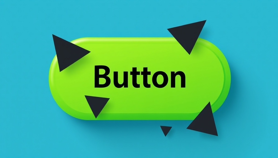
Understanding the Design of Email Buttons
Email buttons come in various forms, from traditional CTA buttons encouraging immediate interactions to bulletproof buttons designed to render consistently across all email clients. It's essential to consider not only the button’s aesthetic but also its functionality. Different styles, such as padded, border-based, and VML (Vector Markup Language) buttons, each serve unique purposes to maintain visibility and engagement across platforms.
Mobile Optimization: A Key to Success
With approximately 61% of emails being opened on mobile devices, ensuring that email buttons are optimized for mobile usage is critical. The tap areas should be at least 48 x 48 pixels, ensuring they’re easily clickable. Furthermore, careful placement of these buttons within the email can significantly enhance user experience, especially regarding accessibility for all users.
Color Psychology and Button Text: Making It Work
The color used in email buttons can evoke strong emotional responses and drive click-through rates. For instance, a contrasting color combination between the button and the background can draw attention and encourage clicks. Text on the button should be concise and action-oriented, typically ranging from 1-5 words, providing clarity to the reader about the expected action.
Using Bulletproof Buttons for Maximum Compatibility
Emphasizing the use of bulletproof buttons—those that maintain their integrity across various email clients—is paramount. These buttons can be crafted without images, ensuring they remain viewable even when images are disabled. This is crucial for enhancing accessibility, particularly for users with visual impairments, ensuring that assistive technologies can read and interact with them effectively.
Strategies to Enhance Click-through Rates
To further develop your approach, consider creating emails that include primary CTAs placed near the top for immediate visibility. Utilizing white space surrounding buttons to reduce clutter can make it easier for recipients to take desired actions. Additionally, employing background images and contrasting colors while adhering to design principles can reinforce brand identity and user engagement.
Future Trends in Email Button Design
As email marketing continues to evolve, adapting to new technologies and user preferences is key. The rise of dark mode in email clients is a notable trend where buttons need to be designed in a way that accounts for both dark and light backgrounds. This could necessitate a dual-image approach that adjusts depending on the user’s email settings, ensuring optimal readability and user experience.
Conclusion: Crafting Email Buttons That Convert
The art of crafting effective email buttons is indispensable in modern email marketing strategies. Through thoughtful design, color usage, and mobile optimization, marketers can enhance user engagement significantly. As you craft your next email campaign, let these strategies guide your approach to designing buttons that not only attract attention but inspire action, ultimately driving improved marketing ROI.


Write A Comment