 Add Row
  Add
Add 


The Flawed Obsession with Icon-Only Design
In today’s digital landscape, minimalism has taken a stronghold, with designers and developers favoring sleek, icon-heavy interfaces over text labels. This trend, while visually appealing, often undermines user experience and accessibility. As professionals, business owners, and marketers strive for innovation, it's essential to consider the actual effectiveness of these design choices.
Why Icons Are Not Always the Solution
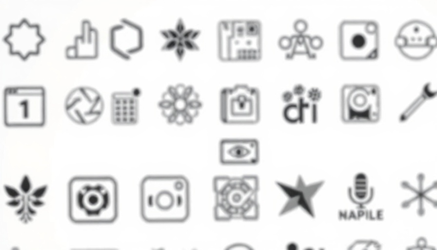
Iconography has long been heralded as the language of the web, providing a compact visual representation of various commands. However, their abstract nature can sometimes lead to confusion. Christopher Butler, in his defense of text labels, underscores the downside of icons: the interpretation of their meaning can vary significantly across different contexts.
For instance, think of the commonly used pencil icon for “edit.” To some, it might suggest editing, while others might associate it with creating new content. This ambiguity can significantly hinder usability, especially in applications involving complex interactions, like project management tools or customer relationship management (CRM) systems.
The Essential Role of Text Labels
Text labels offer clarity and reduce the cognitive load placed on users. As Butler points out, clear and direct labels—like “Save” or “Delete”—ensure that users do not have to guess what an icon represents. This straightforward communication allows for faster interactions and a more efficient overall experience.
Consider the use of a trash can icon widely recognized as “delete.” In some cultural contexts, this might be understood differently, demonstrating that icon comprehension is not universal. Text labels eliminate this confusion entirely, ensuring that users from various backgrounds can decode the interface without frustration.
Accessibility: A Crucial Factor Often Overlooked
Accessibility is a fundamental consideration in modern design, and icon-heavy designs frequently fail to cater to the needs of all users. For those with visual impairments or cognitive disabilities, icons can be daunting. Text labels, compatible with screen readers and assistive technologies, can create a more inclusive environment for users who experience difficulties.
Additionally, some users simply prefer the straightforwardness of reading text over deciphering icons, which can introduce unwarranted complexity into their interactions with technology.
Reassessing Minimalism in Design
While minimalism is often associated with modern aesthetics, designers must strike a balance between style and functionality. It’s not enough for a design to look clean and elegant; it must also serve to enhance usability and user understanding. Misguided design practices might sacrifice clarity for aesthetics, leading to frustration over seamless navigation.
In Butler’s critique of minimalistic design, he encourages professionals to analyze real user needs instead of adhering strictly to visual trends. After all, the ultimate objective of any design is to facilitate user interaction, not to create visual confusion.
Best Practices for Balancing Icons and Text Labels
So, what can designers and marketers do to improve user experience? Here are some actionable tips:
- Combine Icons with Text: Wherever you use an icon, ensure it is accompanied by a clear text label. This combination reduces ambiguity and enhances functionality.
- Test Icon Recognition: Conduct user tests to gauge whether your icons are easily recognizable and whether they convey the intended meaning.
- Focus on Context: Be mindful of the cultural differences that might affect how users interpret icons. Where possible, adapt your iconography to be more universally understood.
- Prioritize Accessibility: Ensure your designs are accessible to all users, utilizing text labels that assist those relying on screen readers.
- Evaluate User Feedback: Regularly solicit feedback from users to improve the clarity and functionality of your design. User insights are invaluable for ongoing optimization.
Conclusion: A Call for Thoughtful Design
Redefining your approach to design by moving away from the exclusive use of icons can greatly benefit user experience. The time has come for professionals, business owners, and marketers to acknowledge that while icons may enhance visual appeal, text labels are indispensable for clarity and usability. In the end, a successful interface communicates effectively and prioritizes user needs. Consider re-evaluating your design choices for greater effectiveness.
Take this opportunity to improve your user experience strategies and enhance your digital marketing effectiveness. By refining your approach to design, you’ll not only engage users more effectively but also cultivate greater brand loyalty and customer satisfaction.


Write A Comment